I spent a month living with the Tilt Five mixed-reality dev kit on my desk, on my coffee table, and — embarrassingly often — in the middle of the living room carpet while I debugged raycasting math at 2 a.m. The kit is delightful: the holographic glasses are lightweight, the retrofitted gameboard optics are clever, and the promise of tabletop AR that multiple people can share felt like the future I’d been waiting for. But the experiment also reminded me why spatial user interfaces are so much harder in the real world than in demos and marketing videos.
What is the Tilt Five dev kit, and why try it?
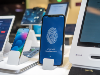
The Tilt Five system combines a reflective gameboard, a wand controller, and a pair of AR glasses that project bright images onto the board’s surface using retroreflective optics. It’s designed for social tabletop experiences — think board games, miniatures, and collaborative visualizations — not full-room VR. I wanted to test it because it’s one of the few consumer-focused kits that pushes for shared mixed reality rather than isolated headset experiences. As someone who writes about practical tech, I wanted to stress-test it in everyday contexts: different lighting, multiple users, complex UI interactions, and the messy physics of human hands and pets.
First impressions vs. daily reality
Out of the box, the Tilt Five demo games and scenes look magical. The holograms sit convincingly on the board, scale well, and the system’s latency felt acceptable in casual play. But after a few days, the initial gloss fades and small, real-world problems start to dominate the UX.
- Calibration brittleness: The system requires a reliable eye-to-board and wand-to-board calibration. That calibration is sensitive to seating position, head tilt, and even spectacles. If someone leans back in their chair, the world subtly shifts. That’s okay for short sessions but frustrating for a multi-hour prototype test.
- Lighting sensitivity: Tilt Five uses retroreflective material that’s great in controlled lighting but struggles with bright sunlight or reflective indoor lighting. I had one afternoon where whole sections of UI disappeared because the sun angle washed the board. Your mileage will depend on your room and how much control you have over lighting.
- Occlusion and finger interactions: The system’s occlusion model is basic. If a player’s hand hovers over a hologram, the optical effect doesn’t always occlude it accurately, so a virtual token can appear to float over your actual finger — visually odd and ergonomically confusing when you’re trying to pick things up.
- Shared-perspective mismatch: Multiple players see consistent hologram positions relative to the board, but they each have a different vantage point. UI elements that rely on facing the user (floating menus, tooltips, directional arrows) can become illegible or misaligned for some players unless you explicitly design for multiple viewpoints.
Practical spatial UI pitfalls I encountered
Designing for spatial UIs isn’t just about placing assets in 3D. After a month I kept returning to a short list of recurring pitfalls that new MR creators underestimate.
- Assume variable head poses: People don’t hold their heads at canonical angles. A UI element anchored at a “comfortable” head height for one user might be awkward for another. Design UIs that either reflow for each user or live on the board rather than relative to a single head pose.
- Avoid tiny, detailed targets: Depth perception and optical blur reduce the effective precision of pointing. Small buttons and thin lines may look sharp in screenshots but are maddening during play. Bigger, bolder targets improve discoverability and reduce mis-activation.
- Design for hand occlusion: Don’t rely on the system to occlude hands perfectly. Use animations, shadows, or tactile metaphors (e.g., magnified grab area) so users can confidently interact even if the occlusion is imperfect.
- Make state explicit: Spatial UIs can hide state changes behind motion or angle-dependent visuals. Explicit visual feedback (glow, scaling, sound) is crucial so players know when an object is grabbed, hovered, or locked.
- Plan for lighting variability: Mock up your UI under multiple lighting scenarios. High-contrast outlines, emissive edges, and fallback 2D HUDs can salvage usability when optics get overwhelmed by bright light.
Specific technical annoyances that leaked into UX
Developing interactive features highlighted a few technical gaps that directly impacted user experience.
- Tracking jitter: Even small micro-jitter in the wand or headset tracking makes precise placement tasks tedious. Smoothing helps, but over-smoothing introduces input lag. Finding the right balance is task-dependent.
- Raycast reliability: Raycasting from the wand to the board is the primary selection mechanism. But when the board surface isn’t perfectly flat or is occluded by objects (like cups), hit-tests can yield unexpected results. It forces the app to be robust: fallback collisions, bigger interaction volumes, and forgiving snapping mechanics.
- Multi-user input arbitration: When two players try to manipulate the same object, conflict resolution matters. Without clear locking metaphors, users get into tug-of-war interactions. Implement explicit ownership indicators and gentle timeouts to reduce friction.
Design patterns that saved my sanity
After trial-and-error, a few patterns consistently improved usability across the board (literally).
- Board-centric UIs: Keep primary controls and game tokens on the board surface rather than floating mid-air. They’re easier to read and less dependent on head pose.
- Adaptive scaling: Scale UI elements based on viewer distance and angle. If someone leans in, increase hit areas and UI size proportionally.
- Persistent toolbars: Use small persistent toolbars at board edges that are accessible by all players instead of transient HUDs tied to one headset.
- Visual affordances for grabbing: Animated outlines, soft shadows, and grow-on-hover affordances reduce guesswork and make interactions feel tactile even when occlusion fails.
- Conflict resolution flows: Visual locks and gentle takeover flows (e.g., “Player 2 requests control — accept?”) prevent chaotic multi-user interactions.
A quick comparison: Tilt Five vs. other tabletop AR approaches
| Aspect | Tilt Five | Phone/tablet AR |
|---|---|---|
| Shared view | Yes — consistent on board for all viewers | Plugin-based sharing or only through screens |
| Interaction device | Dedicated wand + board | Touch & gyro — familiar but singular |
| Lighting sensitivity | High depending on reflectivity | Varies — camera exposure helps but can auto-expose away details |
| Precision | Good for tabletop scale, jitter matters | Finger touch is precise but occludes view |
Common questions I heard while testing
“Is Tilt Five ready for consumer products?” It depends on the product. For casual social games and demos, yes — it’s delightful. For precision productivity or enterprise spatial UI that needs consistent, lighting-agnostic performance across environments, not yet.
“Will it replace physical board games?” Not completely. The tactile fun of physical pieces remains important. Tilt Five shines when it augments physical play — animated tokens, dynamic overlays, or invisible bookkeeping — rather than trying to fully replace tactile elements.
“Should designers learn 3D UI design now?” Absolutely. But start with constraints: design for multiple viewpoints, assume variable lighting and calibration, and test on real users quickly. The UX patterns that work in headsets don’t always translate to shared tabletop experiences.
One unexpected delight
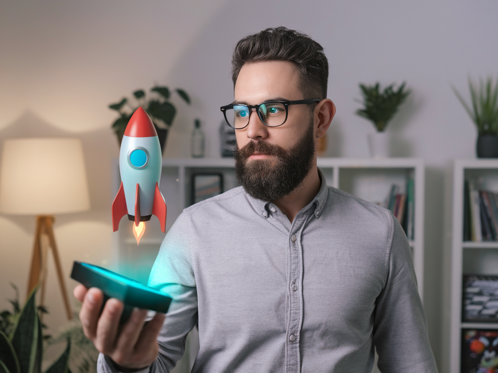
Despite the frustrations, some moments were genuinely magical. I watched a group of non-technical friends gasp when a tiny sculpted dragon hopped from card to board and breathed fire that actually lit the surface. The social, discoverable nature of shared MR is compelling in a way solo VR often isn’t. Those interactions are the reason we keep iterating on spatial UIs — when they work, the experience is memorable and social in a way that flat screens rarely achieve.
Over the month, the Tilt Five dev kit taught me that the future of spatial interfaces will be less about perfect optics and more about resilient design: interfaces that accept messy rooms, unpredictable humans, and imperfect sensors — and still feel delightful. If you’re building for mixed reality, start with generosity: generous hit targets, generous visual feedback, and generous tolerance for real-world chaos.